5 Things Tableau Has That Power BI doesn't


I work in both Tableau and Power BI every week. Each tool has its strengths: Power BI shines with governance, cost-effectiveness, and seamless Microsoft integration, while Tableau often leads in flexibility, advanced interactivity, and sophisticated data storytelling capabilities.
But there are a few features in Tableau that I really wish existed in Power BI. If you’ve ever switched back and forth between the two, you’ll know exactly what I mean. Here are five of them that make my work significantly easier in Tableau.
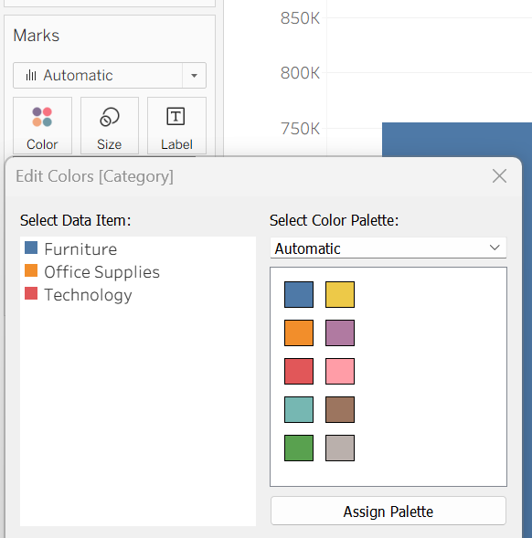
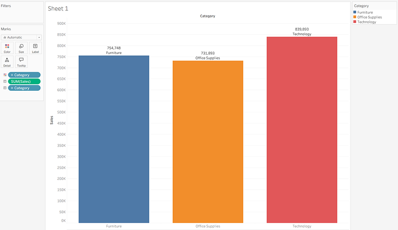
1. Instant Color by Category with the Marks Card
In Tableau, the Marks card is pure magic for visual encoding. You can simply drag a dimension directly onto the Color shelf, and Tableau instantly applies different colors to marks based on the field’s values and members. Want each category shaded differently? It’s literally a one-second drag-and-drop operation.
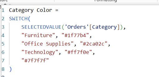
In Power BI, this simple task becomes surprisingly complex. Users often need to create DAX measures with SWITCH statements and assign colors to each category manually, or use conditional formatting with complex setup. While it’s certainly achievable, it lacks the intuitive, immediate workflow that Tableau provides.
The Impact: This difference becomes particularly noticeable when you’re rapidly iterating through different color encodings during exploratory analysis. In Tableau, I can test multiple color schemes in seconds; in Power BI, each change requires deliberate setup.
2. Sophisticated Label Customization Without DAX
Tableau makes labeling elegantly simple. You can drag any field to the Label shelf on the Marks card and customize it instantly. Want to label only the highest point, or display labels only for negative values? There are built-in options that require just a checkbox or dropdown selection.
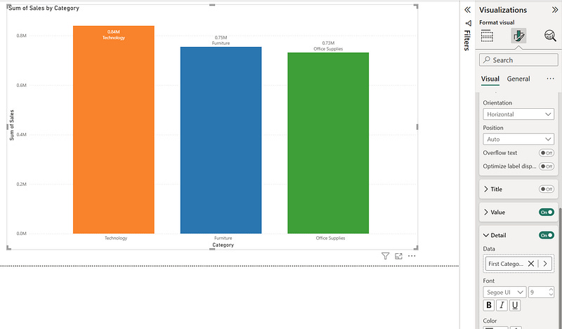
In Power BI, achieving the same level of label control often means writing conditional DAX formulas or working within limited formatting constraints. While DAX is powerful, sometimes you just want labels without needing to code logic for basic display conditions.
The Reality Check: This isn’t to say Power BI can’t handle advanced labeling, it absolutely can. But the cognitive overhead is higher, especially for users who aren’t DAX-fluent or when you need quick, iterative label adjustments.
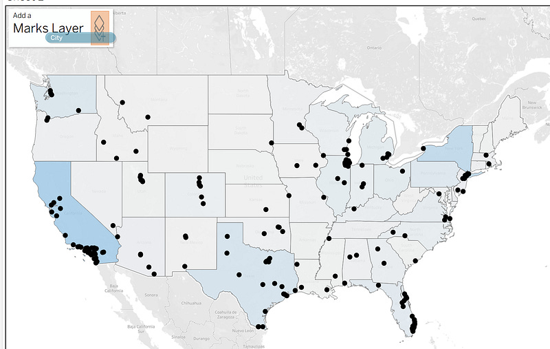
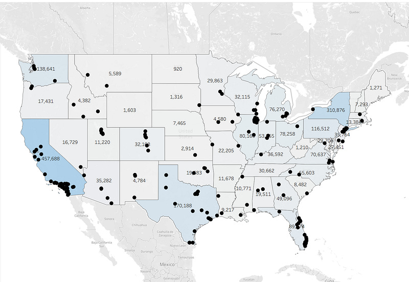
3. Multi-Layer Mapping Capabilities
Here’s where Tableau truly shines: map layers. Tableau allows you to overlay multiple data sources and mark types on the same map: polygons, points, density layers, and lines , all simultaneously. You can build rich geographic narratives with different data layers contributing to the story.
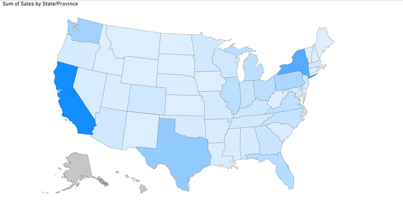
In Power BI, the mapping functionality is notably limited when it comes to multiple layers. You’re essentially restricted to a single map visual type per visual, unless you bring in custom visuals like ArcGIS or third-party solutions. While Azure Maps in Power BI does offer some layering capabilities, it’s still not as seamless as Tableau’s native multi-layer approach.
Power BI’s native maps don’t support data labels. You can’t add text labels to show city names, values, or any other information directly on your map points. This seemingly basic feature simply isn’t available without custom visuals or workarounds.
The native mapping feels like an afterthought, functional for basic choropleth maps, but frustrating for serious geographic analysis.
For Geographic Analysis: If your work involves complex geographic data visualization, this limitation can be a significant constraint. Tableau’s mapping remains the gold standard for multi-dimensional geographic storytelling.
4. Dynamic Zone Visibility & Parameter Actions
These two features represent Tableau’s interactive sophistication at its finest:
Dynamic Zone Visibility allows you to show or hide containers, worksheets, or any dashboard objects based on parameter values or field conditions. Released in Tableau 2022.3, this feature uses Boolean parameters or fields to control visibility, creating layered, contextual dashboards.
Parameter Actions enable users to click on data points and instantly change parameters, which can update date ranges, swap metrics, or modify entire dashboard contexts with a single interaction.
In Power BI, you can approximate these behaviors using bookmarks, slicers, or DAX-driven conditional measures, but it requires significantly more setup and doesn’t offer the same level of native, intuitive interactivity. Power BI’s approach often requires multiple workarounds where Tableau provides direct, purpose-built functionality.
User Experience Impact: These features enable Tableau dashboards to feel more like interactive applications than static reports, providing users with contextual information exactly when they need it.
5. Layout Containers for Professional Dashboard Architecture
Tableau’s horizontal and vertical layout containers are architectural tools that let you structure dashboards with precision. Horizontal containers arrange components left-to-right and control height uniformly, while vertical containers stack components top-to-bottom and manage width consistently.
The Power of Nested Containers: You can nest containers within containers, creating sophisticated grid-like structures that maintain relationships between dashboard elements. When you resize the dashboard or change screen sizes, everything maintains its proportional relationships.
In Power BI, the approach is fundamentally different — everything is essentially “floating” with an optional grid system. While Power BI offers helpful features like Smart Guides, Snap to Grid, and alignment tools, it doesn’t provide the structured, hierarchical layout control that Tableau’s containers deliver.
Professional Polish: This difference becomes apparent when building complex, multi-section dashboards or when ensuring consistent layouts across different devices. Tableau’s container system provides a more architectural approach to dashboard design.
The Bottom Line
None of this diminishes Power BI’s considerable strengths , its cost-effectiveness, Microsoft ecosystem integration, and rapid development pace make it an excellent choice for many organizations. These features represent areas where Tableau’s design philosophy prioritizes certain types of flexibility and user experience.
As both platforms continue evolving, it’s possible some of these gaps may close. But for now, these five capabilities keep me reaching for Tableau when I need that extra level of visual sophistication and interactive control.
Have experience with both platforms? Share your own “wish list” items or let me know if you’ve found elegant workarounds for any of these challenges.
Stay tuned: In my next article, I’ll flip the script and highlight 5 features Power BI has that Tableau doesn’t. Fair is fair, both tools have their strengths, and it’s important to understand where each excels. Subscribe or follow to catch that post when it drops!