Building a Tableau Quality Dashboard in MotherDuck with Claude AI without writing a single line of code
How I recreated a Tableau Public viz in under an hour using conversational AI, and how you can too.

I’ve been building dashboards in Tableau and Power BI for over a decade. I know what polished takes. The hours on layout, the color palette iterations, the pixel pushing on KPI cards.
So when I decided to test MotherDuck’s Dives feature with Claude as my copilot, I expected maybe a bar chart. Maybe some numbers on a page.
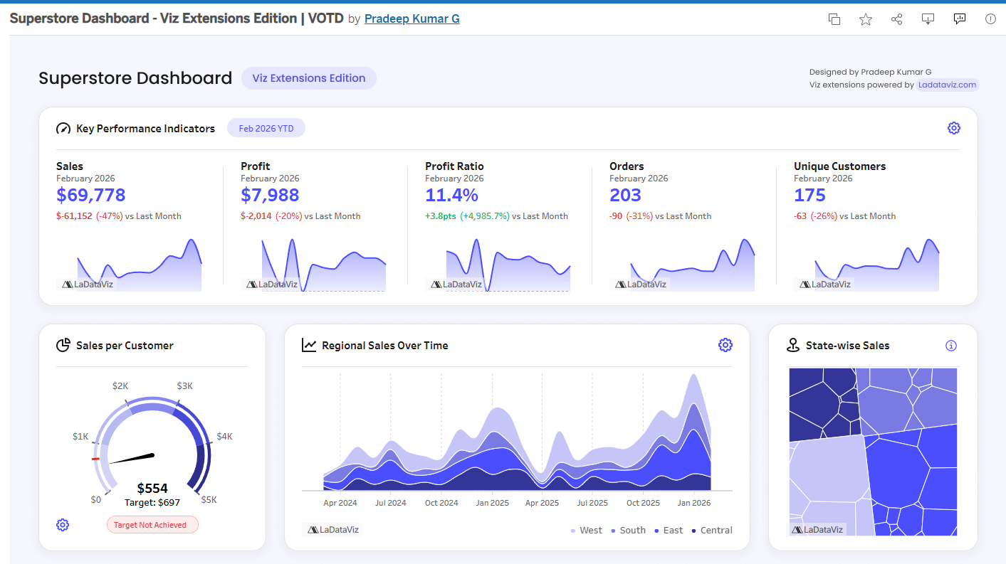
I got a fully interactive, branded dashboard with 12 visualization components. In under an hour.
The Setup
MotherDuck is a serverless data warehouse built on DuckDB. Their MCP integration lets Claude query your databases directly, understand your schema, and build React visualizations called "Dives" that live in your MotherDuck account.
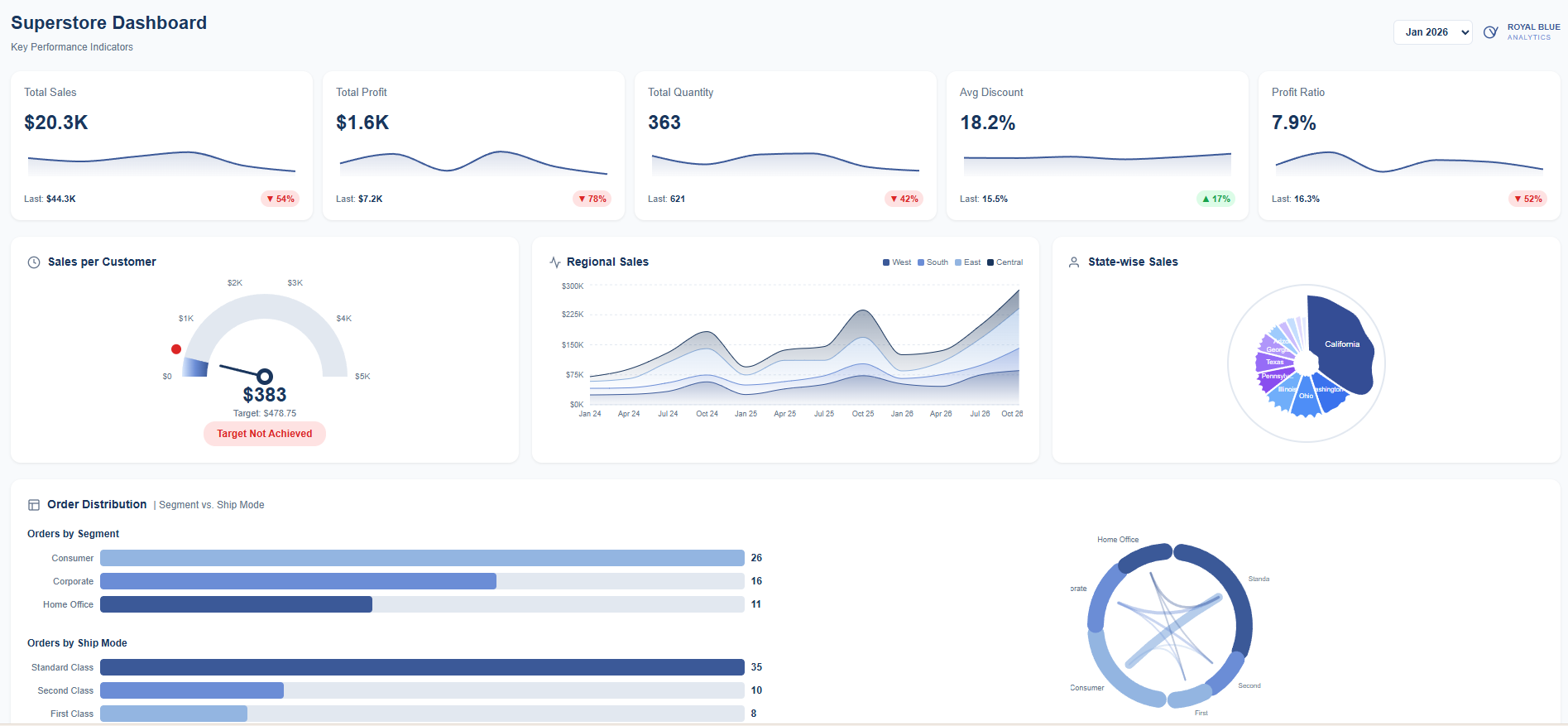
I loaded the Tableau Superstore dataset into MotherDuck. 10,000+ orders, 4 years, 17 sub-categories, 4 regions, etc.
Then I pulled up a dashboard from Tableau Public and told Claude: “Let’s recreate this.”
The Build
I wanted to test out my prompt engineering skills.
I didn’t write a single line of code.
I just described what I wanted.
Claude queried the data, proposed a layout, built it.
When something wasn’t right I’d say stuff like:
“Stack the KPIs vertically and make the trend an area chart”
“The line chart should match the height of the KPI section”
“Show the other sub-categories as light blue lines in the background”
It just worked and each iteration took seconds.
What We Built
The final dashboard:
5 KPI cards with sparklines and period over period comparisons
Sales per Customer gauge with gradient fill and target marker
Regional sales stacked area chart for West, East, Central, South
Circular Voronoi treemap showing state sales as organic polygon cells
Order distribution bars plus a chord diagram connecting segments to ship modes
Customer segmentation radar with RFM scoring
Sub-category spaghetti chart with all 12 categories visible and Appliances highlighted
Everything responsive.
The period filter works and Pick any month from 2023 to 2026 and watch the charts update with live SQL.
Under the Hood
MotherDuck Dives are React components using a custom hook called useSQLQuery that pulls data straight from your warehouse. Claude writes the JSX, the Recharts configs, custom SVG components. All of it.
When you save a Dive, MotherDuck hosts it. Queries run against your actual data. No static exports. Data updates, dashboard updates.
Your Turn
Here’s what I want you to try:
Go to Tableau Public. Find a viz you love. Something that made you stop scrolling.
Download the data. Most vizzes let you grab the underlying dataset.
Load it into MotherDuck. Free tier works.
Connect Claude via MCP. Takes about 2 minutes.
Tell Claude to recreate it. Screenshot the original, describe what you want, iterate.
See how close you get. See how long it takes.
I want to see what you build. Tag me when you post it.
MotherDuck
Tableau
Sekou Tyler is the founder of Royal Blue Analytics, a Nashville based data analytics and AI strategy consulting firm. Tableau Ambassador. Microsoft Certified Trainer. Nashville Power BI User Group leader. Always poking at new tools to see what breaks.